- For Simplicity Technique i chose that picture because it catches your eye on the smoke and dust that is coming out of the building and on the top left you can see the building slanted into a side .
- For the the rule of thirds i chose the picture of the man crossing the street because as the rule says they need more space within the picture because if not its going to look like their going to just walk out of it .
- For Lines Technique i used the picture of the building because of its texture you can see the vertical lines the building used to have and how people started jumping off it .
- For Balance technique i used the picture of the firefighters helping the man out . I chose it because the background has objects that are slanted and as they carry the man they are too .
- For the framing technique i chased the picture with trees on the top covering part of the building behind. I chose this picture because the trees gave the picture frame on the top..
- For The Avoiding mergers i chose the picture with the people helping others out because one of them was cut off from the back and also his hand was cut off .
Friday, September 27, 2013
Photo Composition Reflection
Avoiding Mergers

Framing

Balance

Lines

I chose this picture for Lines because the structure of the building was in vertical lines (up & down) and as you can see people jumping from the top of the building going down , making a vertical fall too.
The Rule Of Thirds

Simplicity

Wednesday, September 25, 2013
Elements of Art And Principles Of Design In Photography
 Line - marks made by a pointed tool such as a paint brush , pencil, pen , they can be thick or thin loops or no loops or zig zag lines
This explains the elements of art and principles designs of lines. I used the painting above as an example because you can see many lines going different ways and some curves .


 Shape - circles , triangles , rectangles , squares with uniform measurements
 This explains the elements of art And principles of design of shapes. I used this painting as an example because it shows different varieties of shapes including , circles , rectangles , squares etc .

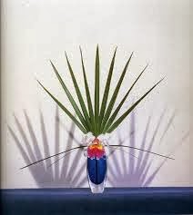
Color -wheels show the primary colors, secondary colors, and the tertiary (intermediate) colors. They also show the relationships between complementary colors across from each other, such as blue and orange; and analogous (similar or related) colors next to each other such as yellow, green, and blue. Black and white may be thought of as colors but, in fact, they are not. White light is the presence of all color; black is the absence of reflected light and therefore the absence of color

This explains the elements of art And principles of design of color. I chose the painting above for color because it has different sorts of colors like the color wheel , it has red , green , orange , blue , yellow , purple etc . Like the picture below of the bird and its beautiful wings and tail .

 Value ( Form ) -Value, or tone, refers to dark and light; the value scale refers to black and white with all gradations of gray in between. Value contrasts help us to see and understand a two-dimensional work of art.
This explains the elements of art And principles of design of value as you can see in the painting and in the picture the darker parts are used as value making the bright parts brighter.


This explains the elements of art And principles of design of texture because in the painting it looks like if you were looking at flowers in real life but its actually the texture the painter made as and example the picture below has texture with the cracks in the tree.


This explains the elements of art And principles of design of space because in the painting the rocks look apart of distance from land and the surrounding its just water .
Balance -is the comfortable or pleasing arrangement of things in art. There are three different types of balance: symmetrical, asymmetrical, and radial. The human figure is symmetrically balanced; the same on the left and right side. The tree is asymmetrically balanced; its branches are not distributed equally on each side, but their total weight is balanced left and right. The sun is an example of radial balance; all its rays are equal in length from the center.
 Contrast -is created by using elements that conflict with one another. Often, contrast is created using complementary colors or extremely light and dark values. Contrast creates interest in a piece and often draws the eye to certain areas. It is used to make a painting look interesting.
This explains the elements of art And principles of design of contrast because it uses light and dark values and draws the eye to important areas .

- Emphasis -in the focal area of an artwork gives it importance. An artist may stress some elements of the design over others. The eye of the viewer will focus on the area of emphasis or center of interest first, then take in the rest of the composition.


This explains the elements of art And principles of design of emphasis because the painting and the picture catches your aye and pays attention to the main ting in the picture .
Movement -in an artwork means the artist is taking viewers on a trip through the work by means of lines, edges, shapes, and colors often leading to the focal area. Movement is a visual flow through the composition. It can be the suggestion of motion in a design as you move from object to object by way of placement and position. Directional movement can be created with a value pattern. It is with the placement of dark and light areas that you can move your attention through the format.


This explains the elements of art And principles of design of movement by the painting having different types of lines , edges , shapes , and color the same goes to the wave having that round shape in the middle of the wave .
Pattern -Patterns are made in art when the same shapes or elements are repeated again and again. Pattern uses the elements of art in planned or random repetitions to enhance surfaces of paintings or sculptures.

This explains the elements of art And principles of design of pattern , the shapes often repeat and so as the color and as the picture shown above is a good example of repetition .

This explains the elements of art And principles of design of rhythm because it has repetitions of lines curving and the element recurs regularly and the picture below too .


 Unity - means that all elements in an artwork are in harmony. Unity brings together a composition with similar units. For example, if your composition was using wavy lines and organic shapes you would stay with those types of lines and not put in even one geometric shape.
This explains the elements of art And principles of design of unity because it has similar units of shapes and detail and wavy lines like the picture below it repeats the same signal the sign has .
Thursday, September 19, 2013
Post Shoot Reflection
http://nataliasphotojournalismblog.blogspot.com/
One - she really had a good description of her photos , you can easily tell maybe what she was trying to take a picture of & Second - Because like she said on the first picture she made the object pop out having that red strong color .
One thing that maybe could be improved may be the angles of the way she takes the photos even though the first picture was taken at a good angle to make the red pop out .
Photo Manipulation And Ethics
When photoshopping goes wrong it will cost you your job and credibility .
Image manipulation can cause things to go bad either they'll add things to make a picture look better or make a mistake on a picture. For example on the Iranian missiles they added just one more missile to make the picture look powerful when it really isn't they made a missal look like one of the others and took away the missal launcher and just added the missal in the air and more clouds on the bottom .
I think this type of photoshop is uneceptable because its just not right to add or edit something thats not really there just to make it look better . Making people believe that what they see is true it just seems like a joke because the object or whatever it is is not really there .

I find this picture the most unethical because this picture really had different photoshops the person with the kid was spotted way back and they removed a man sitting down on the floor while the man with the kid was facing a different direction .

I consider this less unethical because with the other picture theres really not a difference . The woman on the left looks like theres extra space next to her in the other picture and compared to this one theres not much of a difference. Its just the color it looks darker . It doesn't look bad as others because it really doesn't have a photoshop .
National Geographic Warm-Up

This was my favorite photo of the 45 photos that were posted. This photo caught my attention because of the details it has and how it was taken. As you can see the focal point is in the center of the eye which makes you see the reflection of what the person is looking at . The reflected light makes it look colorful and clear and also you can see the blur effect to left of the picture making it focus on just the right part of the eye .
I would take a picture of a flower because a flower can be captured in different ways . Also a flower is a sign of life , its something you can compare to a human life , like being alive a flower would be open and fresh and can be a good photo to represent something good .
Tuesday, September 17, 2013
40 Greatest Photos Ever

The thing that made me pick this photo was the presence of the dog laying next to her owner that had passed away in the disastrous landslides near Rio De Janiero . This photo looks like if it was taking from the top so the background can be displayed . I think this made the top 40 greatest photos because it shows the emotion the dog is expressing and how his missing her owner . ( Vanderlei Almeida ) 

I picked this picture because its a good description of how the kid is feeling towards the man who is handing him the flag . This photo was taken in a straight position which it looks toward the faces of the kid and the man . I think this made the top 40 greatest photos because it shows respect and has a touch in the heart ! Aaron Thompson

I picked this picture because it really touched me just seeing the expression on the moms face hugging her little girl after 7 months it shows alot . I like how this photo was taken to capture a good shot of the love to each other and how much they missed one another . I think this made it to the top 40 greatest photos because like i said it touches people hearts !
Great Black And White Photography , Part 2

Helen Levitt
Born August , 31,1913
Died March , 29, 2009
Brooklyn , New York
Died In New York , New York
Helen Levitt Was A Photographer , Film Editor And Director Known For Her Captivating Portraits Of New York Urban Life .
Famous Photos : New York 1940
In The Street


Monday, September 9, 2013
Camera Parts
- Aperture - Also called aperture stop, Optics, an opening, usually circular, that limits the quantity of light that can enter an optical instrument .
- Shutter - A mechanical device for opening and closing the aperture of a camera lens to expose film or the like.
- Exposure - The total amount of light to fall on the photographic medium during the process of taking a photograph .
- Depth Of Field - Range Of Distance that appears acceptably sharp .
- F-Stop - The Setting Of an adjustable Lens aperture .
- Focal Length - The focal length of an optical system iIs A measure of how strongly the system converges or diverges light .
Flash Button - controls weather you want more light or just normal shot
Shutter Button - camera lens that exposes film by opening and closing the aperture
Lens Release Button -
Aperture Button - known as "stop" limits the quantity of light that can enter an optical instrument
Exposure Compensation Button -
Erase Button - It erases the shots you don't want
Live View Shooting Button - picture looks real and blurred out from the back
Movie Shooting Button -
Quick Control Button -
Direct Print Button - to print without transferring images to the computer
Menu Button - shows the cameras status
Setting Button - different options that control the shots you take and the camera
ISO Speed Setting Button - Controls the sensetivity of cameras sensor
White Balance Selection Button -
Drive Mode Selection Button -
AF Mode Selection Mode
Display Button -
AE Lock Button -
FE Lock Button -
Index Button -
Reduce Button -
AF Point Selection Button -
Magnify Button - zooms in in a picture
Play Back Button -
Camera History
- 1 . The whole acts like a lens , focusing and projecting light into the wall of the dark chamber .
- 2 . The modern camera came one step closer when Isaac Newton & Christian Huygens perfected the understanding of optics .
- 3 . A glass lens, a dark box , and FILM .
- 4 . Light passes through the lens, into the camera, and exposes the film.
- 5 .Digital cameras capture the images with an electronic sensor called a CCD .
- 6 . In Auto mode the camera will control flash & exposure (A) & On Program you can control the flash with the camera settings .
- 7 .The portrait mode blurs out the background making the object look smooth.
- 8 . Sport mode freezes the motion and has a fast shutter shutterspeed.
- 9 . Its easy to aim the camera at the object , a half press will tell the camera that your almost ready to take a shot and to be prepared .
- 10 . disabled flash , no flash , natural light is used .
- 11 . Auto flash is enabled & it would automatically fire if the came thinks it needs more light .
- 12 . The picture would be washed out .
- 13 . The picture would be too dark .
- 14 .Stop is used in every aspect of photography to represent a relative change in brightness of light .
- 15 . Two stops brighter
- 16 . Two stops brighter
- 17 . More light
- 18 . Less light
- 19 . The aperture controls larger openings like the pupil .
- 20 . Aperture opening also known as an F-stop larger openings = more light .
Thursday, September 5, 2013
Masters Of Black And White Photography

Ansel Adams - Lake Mc Donald Glacier National Park 1942

Karsh - Yousuf Karsh Estrellita Karsh 1963

First Photo - Best And Worst

Subscribe to:
Posts (Atom)